Project Bambini
Story Design | Branding | Copywriting
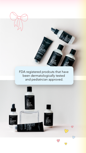
Design elements incorporated in the stories were solid lines, polka-dots, subtle gradients, and fun symbols. I wanted the overall design to be light, bright, fun, modern, and minimal, but still feel young & cute.
The brand colors were pastels, typography decorative, and over all emotional feeling was clean and fun. The voice of the brand was to be very nurturing, soft, and full of key words like: pediatrician approved, hand-made, organic, and plant based.


This was my first client I was assigned to at the creative agency I worked at. I thought it would be challenging to design with pastels and baby shower products because I am more of a modern, dark & moody kind of guy, so this was the complete opposite of me. However, I pushed through to not only make this brand feel modern, but also fun, friendly & soft at the same time. It ended up being a great learning experience to expand the limits of my design styles & capabilities. My client, agency, and myself ended up loving the designs.